
Flow blocks are the individual steps that make up a flow, organized into five categories: Input, Document, Output, Controls, and General. Connector-specific categories, such as Dynamics, may also be available depending on your project. Here is the list of flow blocks:
|
|
Collect Data |
Generate Documents |
Store and Deliver |
|---|---|---|---|
|
NA |
NA |
||
|
NA |
NA |
||
|
NA |
NA |
||
|
NA |
NA |
||
|
NA |
NA |
||
|
NA |
NA |
||
|
Retrieve data with Data Provider |
NA |
NA |
|
|
NA |
NA |
||
|
NA |
NA |
||
|
NA |
NA |
||
|
NA |
NA |
||
|
NA |
Convert document to text |
NA |
|
|
NA |
NA |
||
|
NA |
NA |
||
|
NA |
NA |
||
|
NA |
NA |
||
|
NA |
NA |
||
|
NA |
NA |
||
|
NA |
NA |
||
|
NA |
NA |
||
|
NA |
NA |
||
|
NA |
NA |
||
|
NA |
NA |
||
|
NA |
NA |
Store in Content Manager |
|
|
NA |
NA |
Store in Experlogix Documents Content Manager |
|
|
NA |
NA |
||
|
NA |
NA |
||
|
NA |
NA |
||
|
Update record |
|||
|
NA |
NA |
||
|
NA |
NA |
||
|
NA |
NA |
||
|
NA |
NA |
||
|
NA |
NA |
||
|
NA |
NA |
||
|
NA |
NA |
Store in Microsoft Dynamics 365 F&O |
|
|
NA |
NA |
||
|
NA |
NA |
||
|
NA |
NA |
Create note |
|
|
NA |
NA |
Create task |
|
|
NA |
NA |
||
|
NA |
NA |
Store in SugarAI |
|
|
NA |
NA |
||
|
NA |
NA |
Store in Microsoft Dynamics 365 BC |
|
Managing Zones
Adding zones
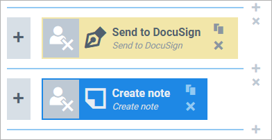
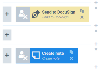
To add a zone, select the + next to one of the lines separating zones.
Clicking this will add a zone above the line:
Deleting zones
To delete a zone, select the X in the upper-right corner of a zone.
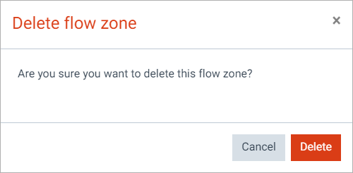
If the zone has one or more blocks in it, you'll be asked to confirm the deletion:
Managing blocks
Properties
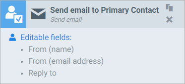
Flow blocks have a few properties:
-
A title bar with:
-
A user icon which displays 1 of 3 user editability states. Select it to toggle through the states:

= the block will always be executed (the icon's meaning is that the user has no say over it).

= the end user can choose whether or not to execute this block. The option to execute the block is ON, but it can be turned off.
-

= the end user can choose whether or not to execute this block. The option to execute the block is OFF, but it can be turned on.
-
An icon, depicting the block's purpose.
-
A name (upper text). You can change this name to whatever you like.
-
A title (lower text). This describes the block's purpose.
-
A clone button.
-
A delete button.
-
-
An area that shows the user editable fields. How to make fields user-editable is explained here.
Adding blocks
To add a block to your flow, select the + in the zone you want to add the block to:
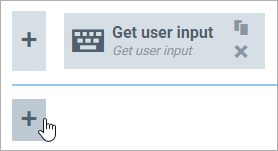
If there's no zone available, you'll have to add one before you can add a block. Clicking the + brings up a window where you can select the block you want to add:
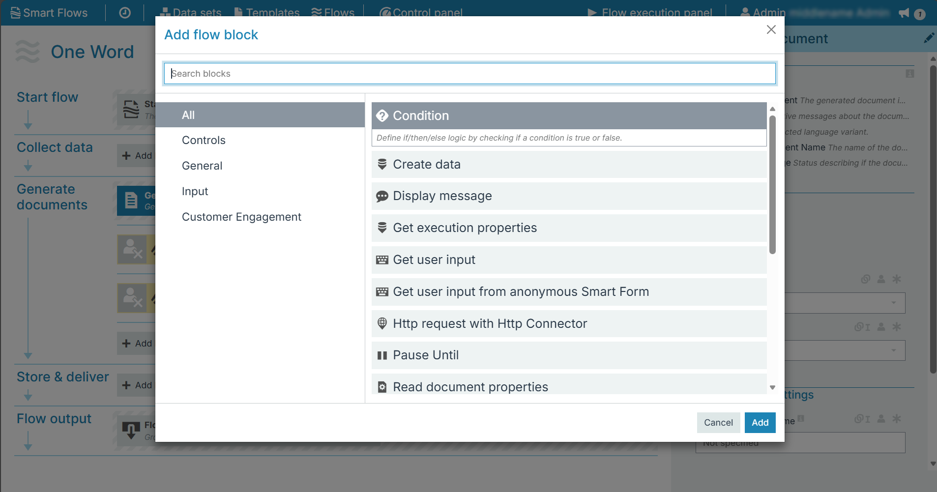
On the left, select the category of blocks you want to look at, or use the search box at the top. On the right, select the block you want to add. Select Add to add the block. Since there cannot be 2 blocks with the same name, your block will get a [1] added if the name already exists.
Support when adding blocks
The flow builder was designed to help you as much as possible: whenever you add a block, you may see screens like this:
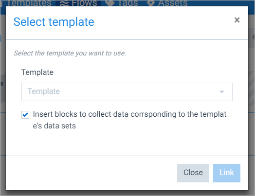
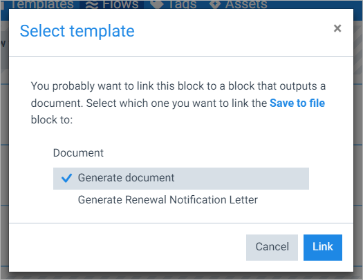
These are designed as shortcuts for actions you will most likely have to take anyway, such as selecting a template for a generated document block.
Moving blocks
Once you've added a block, you can move it by dragging it to where you want it:
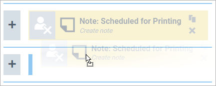
You can move a block anywhere, but keep in mind the flow rule: linked blocks cannot be in the same zone. If you do happen to drag a block to a spot that would violate this rule, you'll be warned that there's something wrong with your block by way of a red icon. You can hover over the icon to see what's wrong:

Re-dragging the block to its original location will solve the issue.
Editing blocks
To edit a block, first select the block. Now the flow block inspector displays that block's parameters:
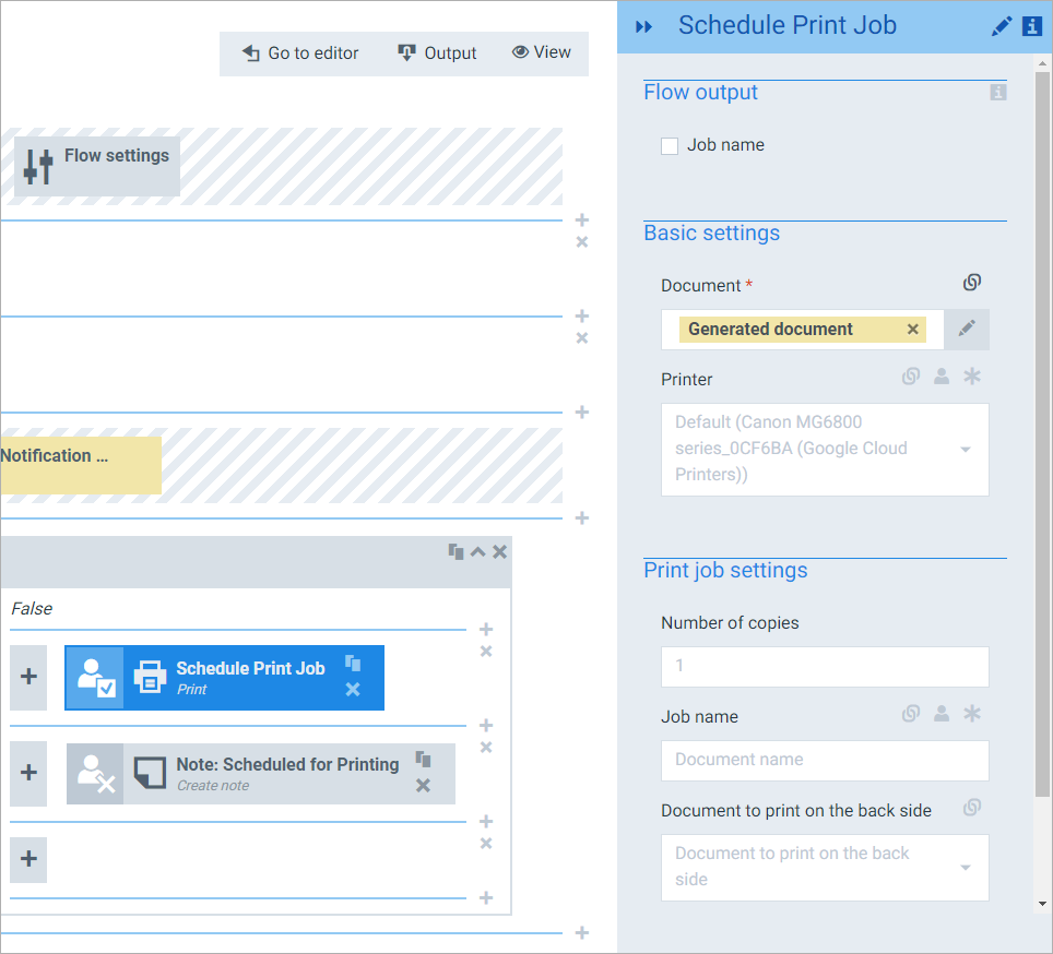
The flow block inspector is where you change a block's parameters and settings, and link blocks together.
Deleting blocks
To delete a block, select the X in its title bar:
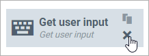
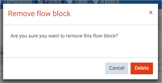
You'll be asked to confirm the deletion:
Invalid blocks
When clicking around in the flow builder, you may notice a block's icon change to a red error icon:
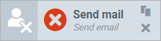
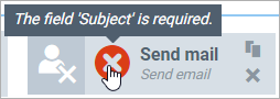
This appears whenever the block's parameters are invalid. This can happen when you move a block to a new position, delete a block etc. You can hover over the icon to see what's wrong:
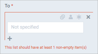
Additionally, the flow block inspector should display wrong/required fields in red:
Start/settings blocks
Flows always start with a locked zone with blocks, such as a Start from block or a Flow settings block:
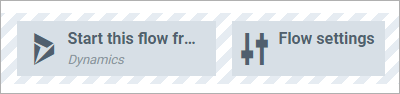
The Start from block allows you to change where your flow starts from. Changing where your flow starts from is a great way to make sure your flow is broken beyond repair (unless you know what you're doing), so we strongly advise you to try this with a clone first. The Flow settings block gives you 2 interesting options:
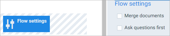
Merge documents is used when you select multiple records and run the same flow for each of them. Enabling this option merges the documents into one, after which the output steps are only done once. A new zone will be added after the mandatory Generate document block:
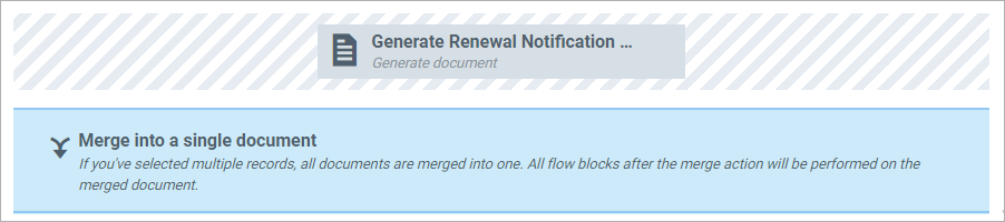
Everything after this 'zone' will be done only once, for the merged document.
Another option is Ask questions first. Enabling this option will force the flow to present all the questions (and everything that is user editable) to the end user at the beginning of the flow, instead of in different screens. This is primarily used in conjunction with Merge documents, where you can then check the Ask questions first box and answer for all selected records at once, instead of having to repeat your answers for every selected record.
Block Settings
The flow block inspector is where you change a flow block's settings. This is also where you link blocks to each other.
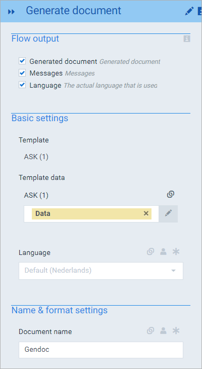
Block name
Select the pencil next to the block name to change the block's name:

Flow output
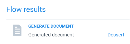
Everything that's enabled under flow output will be presented in the flow's output. For instance:
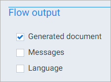
This means that the end user will see a link to the generated document at the end of the flow run:
Block parameters
Every block has parameters that you can change - these are logically grouped together in sections. For instance, the Generate document block has 2 parameter sections:
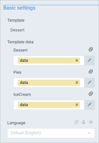
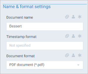
Most parameters are just one input field, such as the template to use in a Generate document step. But some can contain more than one field, such as the To parameter in the Send e-mail block:
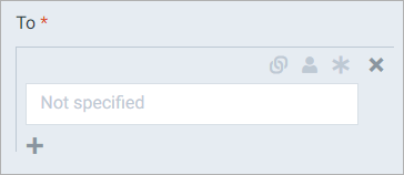
Notice the + under the parameter field. Select it to add another To address:
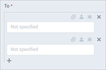
This way, you can use more than one e-mail address for the To parameter.
Select the X next to a field to delete that field.
Making parameter fields user editable and/or required
Most parameter fields come with 3 icons:

To activate an icon, select it to make it dark grey, which means it's activated.
The 
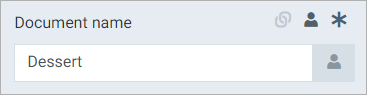
End user view:
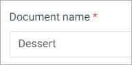
If a parameter field is user editable, the default value of that field is whatever is put in it in the flow builder.
The * icon is used to make this parameter field required. This means that the user executing the flow must provide a value before he/she can continue with the flow. If you make a parameter field required, it automatically becomes user editable as well - it wouldn't make sense to make a field required if the user can't do anything about it.
Providing the end user with pre-defined options
In addition to making a field user editable and thus letting the end user decide which value they want, you can select the user button next to the field to bring up Edit options:

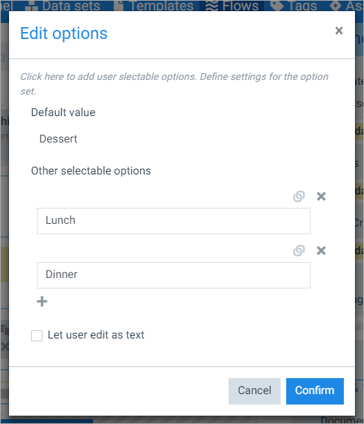
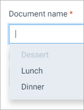
In here, you can provide additional values the end user can choose from. For instance, this screenshot will give the end user 3 options: Dessert, Lunch and Dinner, of which Dessert is the default option. Like so:
The icon changes to blue to show that there are user alternatives defined:

Enabling Let user edit as text will give the end user the possibility to edit the value without having to choose one of the provided options.
Collapsing the inspector
If you're ever tired of looking at the inspector, you can collapse it using the arrows:
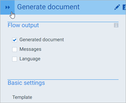
This saves some space on the flow builder canvas. Select the arrows again to expand the inspector. You can also drag the inspector to make it smaller/wider.