
Charts are visual representation of data. They transform raw data into a bar chart, pie chart, or line graph, for easy pattern identification and data analysis. In the Template Builder tab, the user can define the chart structure, define data through data mapping and import data, looping the chart, and more.
Let's take a look at the two types of charts: trend charts and aggregation charts.
Trend Charts
Trend charts are used to display the evolution of data over time. Common examples include revenue per month, the number of website visitors per day, or incidents per week. Additionally, trend charts also represent data that doesn't involve a time frame, such as the number of sales per sales team, the number of incidents per department, or revenue generation per team.
Create Trend Charts
-
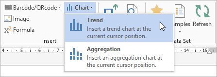
In the Template Builder, select Chart > Trends.
-
Select a chart type and select OK. In this scenario, the column chart type is selected.
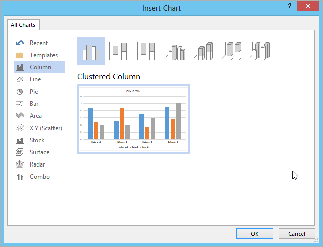
Chart type (column, line, pie etc.) can be changed if required, post creation.
The General dialog box is displayed with the following settings. See the table below for more information on the General tab:
Trend Chart Settings
|
Index |
Name |
Description |
|---|---|---|
|
1 |
General |
In the General tab, you can provide chart a name.
|
|
2 |
Title |
In the Title tab allows you to provide the chart a title. In case of blank field, then by default the chart title is displayed as 'Chart'.
|
|
3 |
Categories |
In the Categories tab you can provide the categories that are displayed in the x variable of a graph. As trend charts are typically used to display an evolution of values over time, categories will often have a time or a date. For example: (Week 1, Week 2, Week 3...), (January, February, March...) Other types of categories that can be used are: For example: (Person A, Person B, Person C...), (Sales Team 1, Sales Team 2...), or (Europe, North America, Asia...) 
|
|
4 |
Series |
In the Series tab, you can provide values against the categories. Select the + icon and you can either provide the values directly or select the fields from the data set. 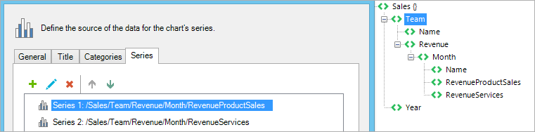
|
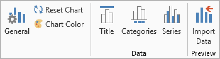
The General dialog box can be accessed by selecting the settings icon in the Mapping tab too. Or, click the Trend chart ribbon and select a setting to view the General dialog box.
-
Click OK.
An excel window is displayed, where you can edit the chart details.
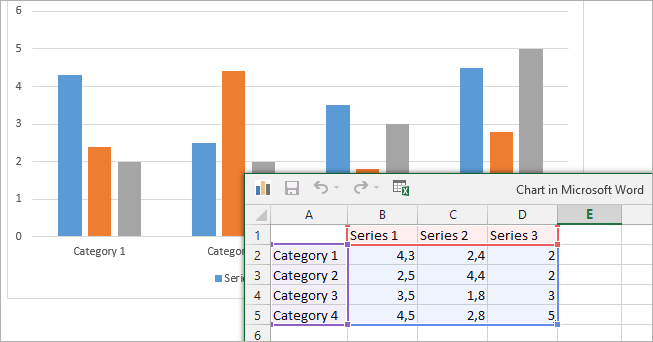
Once you generate a document, these values are ignored as the chart's settings gets updated to use data.
-
Close the Excel window.
-
Select the Mapping tab.
The Trend chart is enabled in the Mapping tab.
Looping
Depending on the data structure, a loop can be added around the chart. Consider the following data:
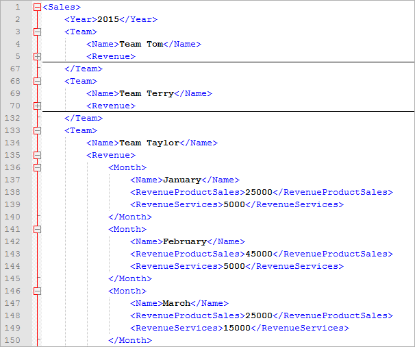
There are 3 teams, and each team has 12 Month elements with associated revenue data. Let's put that data in a trend chart like this:
-
Chart type: clustered column
-
Categories: /Sales/Team/Revenue/Month/Name
-
Series 1: /Sales/Team/Revenue/Month/RevenueProductSales
-
Series 2: /Sales/Team/Revenue/Month/RevenueServices
When a trend chart is rendered in the template, the following in delivered:
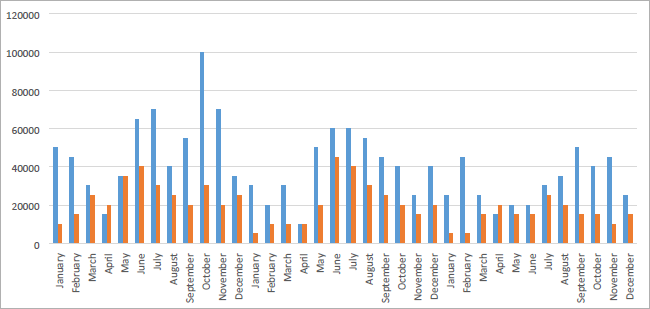
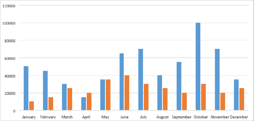
The data displayed in the above image is not based on the user's requirement, as all the months repeat 3 times. This is because the data contains 3 teams, each with 12 months of data, and interprets this as one chart. The solution is to add a loop to the chart.
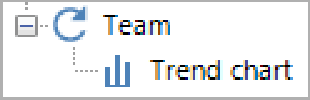
Each team with all the months are displays in three different charts.
Ensure you add the team's name before each chart to avoid confusion.
Aggregation Charts
An aggregation chart summarizes or combines data from multiple sources or categories. Here, you can define a field to aggregate on, a field to group the aggregation by, and a function that defines how to aggregate.
Create Aggregation Chart
-
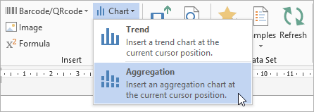
In the Template Builder, select Chart > Aggregation.
-
Select a chart type and select OK. In this scenario, the column chart type is selected.
The General dialog box is displayed with the following settings:
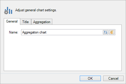
The General dialog box can be accessed by selecting the settings icon in the Mapping tab too. Or, click the Aggregation chart ribbon and select a setting to view the General dialog box.
|
Index |
Name |
Description |
|---|---|---|
|
1 |
General |
In the General tab, you can provide chart a name. 
|
|
2 |
Title |
The Title tab allows you to provide the chart a title. By default the chart title will be displayed as 'Chart'. 
|
|
3 |
Aggregation |
The Aggregation tab allows you to set the following:
Following are the different mathematical logic for aggregating data:



|
-
Click OK.
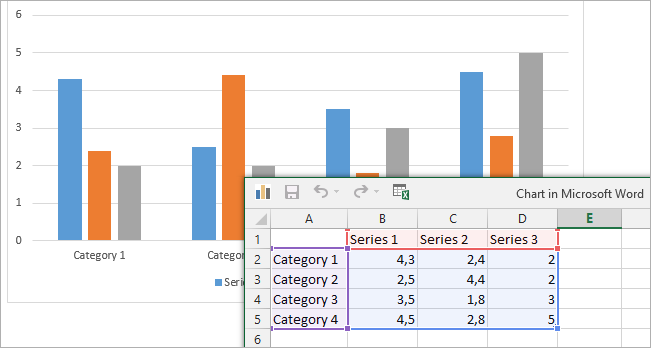
An Excel window is displayed, where you can edit the chart details.
Once you generate a document, these values are ignored as you'll want to change the chart's settings to use data.
-
Close the Excel window.
-
Select the Mapping tab.
The Aggregation chart is enabled in the Mapping tab.
Examples of Aggregation Chart Settings
Let's consider the following data as an example:
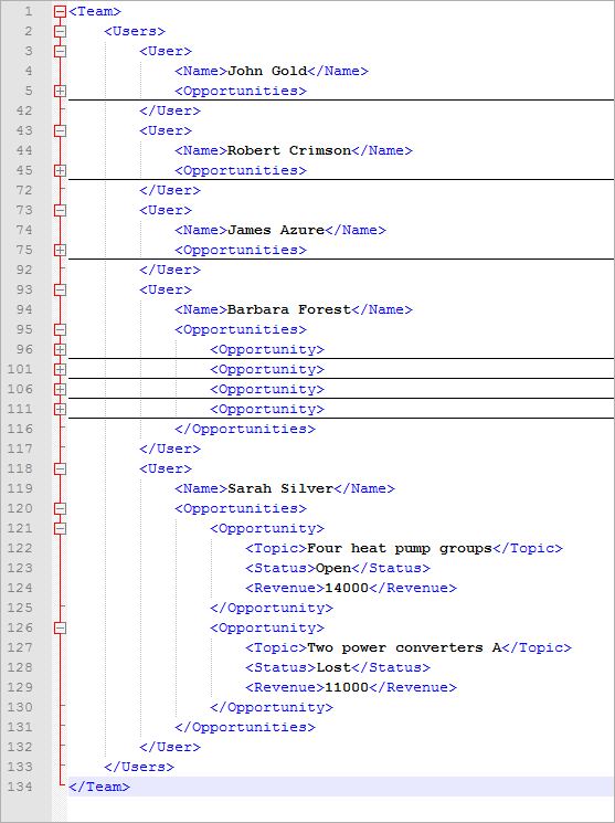
There's a Team with 5 users, each with Opportunities that have a Topic, Status and Revenue. Now we'll use this data to show you how to use aggregation charts to visualize data.
Total revenue per user
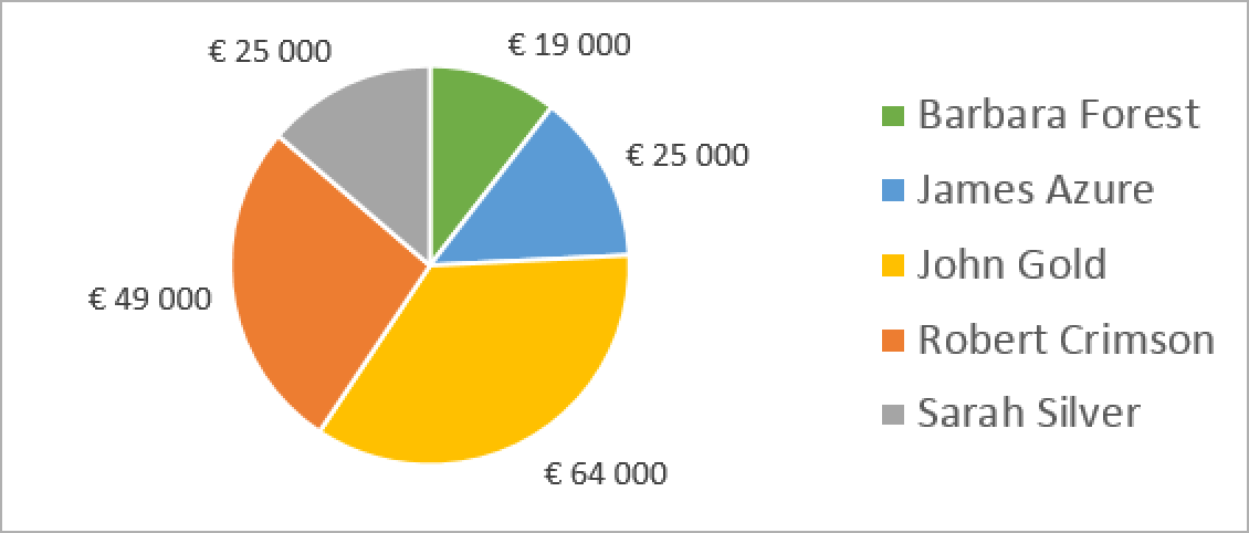
This chart shows the sum of all the revenues, per user, from all the opportunities. To get this, use these settings:
-
Function: Sum
-
Aggregate on: /Team/Users/User/Opportunities/Opportunity/Revenue
-
Group the aggregation by: /Team/Users/User/Name
-
Also group the aggreation by: leave empty
Total number of opportunities per status
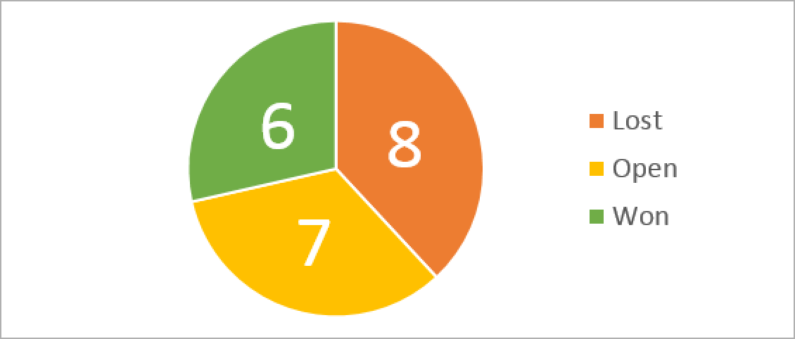
This chart shows the number of opportunities per status. To get this, use these settings:
-
Function: Count
-
Aggregate on: /Team/Users/User/Opportunities/Opportunity
-
Group the aggregation by: /Team/Users/User/Opportunities/Opportunity/Status
-
Also group the aggregation by: leave empty
Total number of opportunities per status, per user
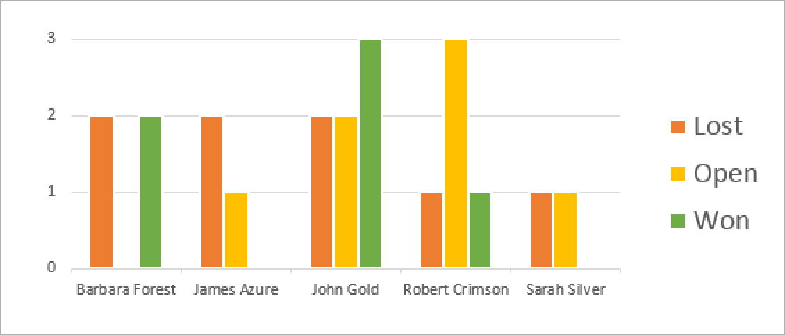
This chart shows, for every user, the number of opportunities per status. To get this, use these settings:
-
Function: Count
-
Aggregate on: /Team/Users/User/Opportunities/Opportunity
-
Group the aggregation by: /Team/Users/User/Name
-
Also group the aggreation by: /Team/Users/User/Opportunities/Opportunity/Status
Total number of opportunities per user, per status
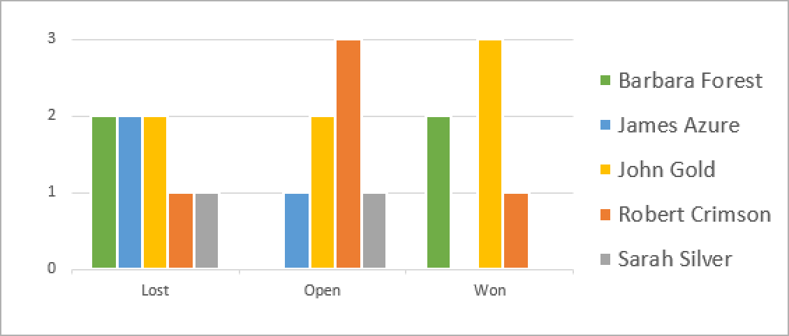
This chart shows, for every status, the number of opportunities per user. This is almost the same as the previous chart, only with the Group by and Also group by fields switched around. To get this, use these settings:
-
Function: Count
-
Aggregate on: /Team/Users/User/Opportunities/Opportunity
-
Group the aggregation by: /Team/Users/User/Opportunities/Opportunity/Status
-
Also group the aggreation by: /Team/Users/User/Name
Import Data
The Import data button allows you to replace the dummy data with the actual data.

Consider a scenario where an aggregation chart is created with the following settings, as shown in the image:
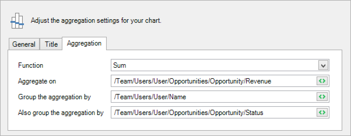
Initially, the chart displays dummy data in the Excel pop-up. Upon selecting Import data, the Excel is updated to display the actual data.
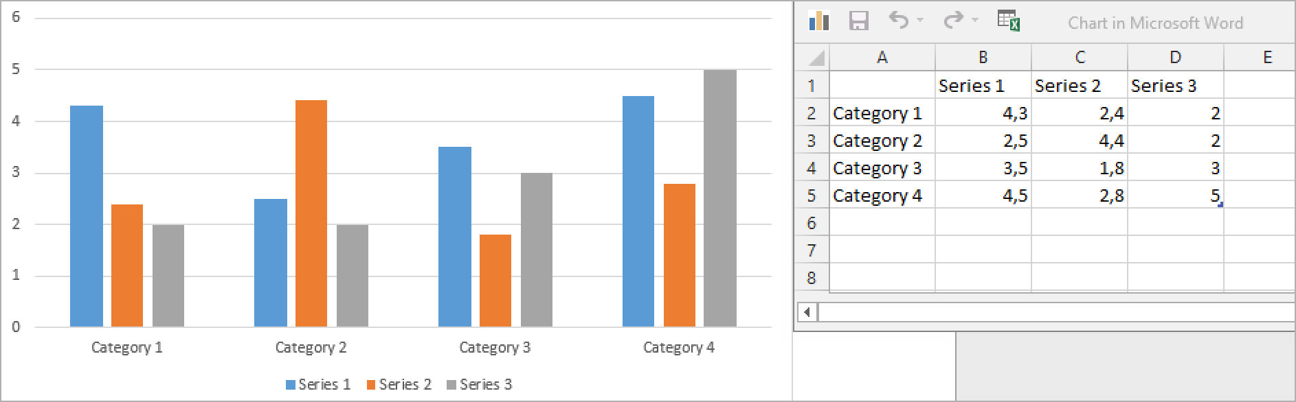
The Import data button will only work when all the following conditions are true:
-
Ensure a sample is available for this template.
-
Ensure the chart's settings are set correctly. It is possible to create an aggregation chart without providing valid data. In that case, import data won't work, and you'll get an error like the one below:
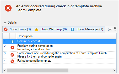
Edit Data
Select Edit data in the Chart Design to view the data of your choice instead of using the default data. You can manually adjust the values in Excel.
The data is dummy and the data is overwritten by Smart Flows data during document generation.
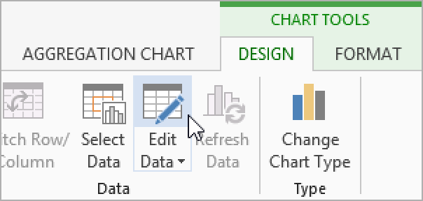
Chart Data Formatting
Chart data is formatted into various formats, such as Numbers with decimals or without, Currency, Dates, Times, Text, and other formats. Microsoft Office may recognize the right format, yet there are instances where users must format the data.
For example, the image below displays the revenue generated by each employee, but revenue is a currency format displayed in regular numbers. This may lead to a misconception of the data.
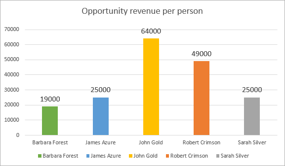
To update the data format:
-
Select Edit data from the Chart Design.
-
Select the data in the Excel spreadsheet.
-
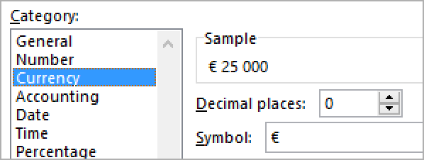
Right-click the data, then select Format Cells.
-
Choose Currency without decimal places and select OK.
The chart displays the revenue values in the currency format. Further, this change also reflects in the outcome of document generation.
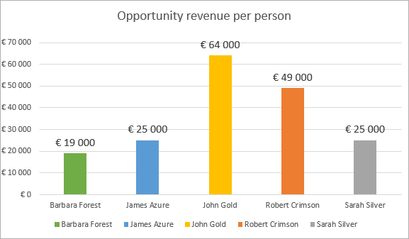
Chart Formatting
Word offers a great number of options for formatting and designing a chart, such as Axis formatting, background formatting, line width, color, and so on. As far as the formatting is concerned, the chart is considered a regular Word chart. To update the chart format:
-
Please look for it in Microsoft's documentation.
-
https://support.office.com/en-us/word - Some information about Word, although not in detail.
-
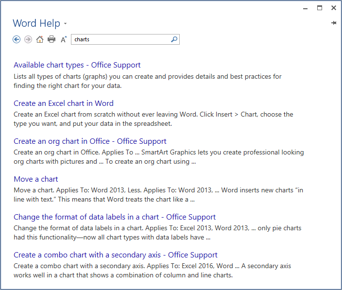
Hit F1 or select the question mark in Word and search for charts:
Maximum Axis Value
When looping over charts, you may notice that each chart in the document has a different maximum axis value. This happens when the axis' maximum value at Auto - set a value to keep the maximum the same across all iterations:
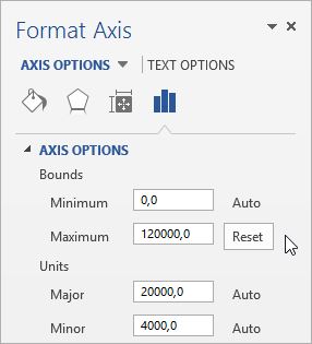
This is a Word setting. Please look through Word's documentation for additional information.
Remove or Copy a Chart
To remove a chart, you may be tempted to select the chart and select delete. This will remove the chart, but not the chart mapping, resulting in a non-functional leftover in the template:
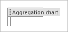
Instead, select the entire chart by selecting the chart label and hitting the delete button.
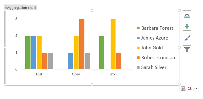
Select a chart and its mapping. In case you copy a chart by selecting it, right-click the chart and select Copy. As a result, the chart is copied without the mapping, thus without the link.
Reset Chart Settings
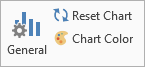
Select Reset chart if you wish to reset the entire formatting of the chart. But the settings (categories, series, aggregation, etc.) will remain intact.
Limitations
-
Exporting a document in a format other than .docx can lead to slight discrepancies between the template and the final document. This issue is particularly evident with 3D charts, where the rendering may vary significantly from what you see in the template. Hence, we advise against using 3D charts.
-
If you plan to output documents exclusively in .docx format, there should be no discrepancies between the template and the final document, even when using 3D charts.
In case the data is not sorted (e.g., 1, 2, 3, 4, 5, 6, 7, 8, 9, 10, 11, 12 appears as 1, 10, 11, 12, 2, 3, 4, 5, 6, 7, 8, 9), then explicitly set the Format (in Excel) to Number, or Text, depending on your sorting preference. If this doesn't resolve the issue, you can create a pseudo-field at the same level as the problematic field and insert it using the Insert Field button. Then, set the pseudo-field to the correct type and use this field in your chart instead of the problematic one. This usually ensures that sorts the data correctly.